Once you’ve created your site layout in Finale 3D by arranging your positions and importing a ground image or Google map, you can generate a site layout diagram in a matter of minutes that includes the usual information that site layouts include — safety circles, a legend, a panel with show information, company logo, etc.
Most of the content displayed in the site layout diagram comes from information you’ve already entered when creating the show. The safety circles, for example, are automatically based on the caliber of the effects in your positions or on the safety distances you’ve manually entered into the position properties. The company logo comes from the “Show > Set show information…” menu item that you’ve probably already employed. The legend automatically contains legend items for every unique element shown in the diagram, and you can change the legend item text to whatever explanations you want.
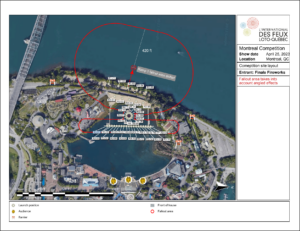
Figure 1 – Site layout for Montreal
The example in Figure 1 shows all the elements of a site layout diagram: the information panel on the right; the legend on the bottom; the positions and safety circles; a compass heading indicating North; a scale bar; icons indicating the audience and other notable features; logo; and rulers showing important distances.
Table 1 – Where the site layout diagram information comes from
| Information source | How the information is incorporated in the site layout diagrams |
| “Show > Set show information…” main menu item | Show name, location, company logo, default orientation of map, and other information in the information panel |
| “Draw mode” link in upper left of site layout view | Basic drawing tools to add your own circles, lines, text boxes, arrows, rulers, standard icons, and imported icon images |
| “Window settings” link in upper left of site layout view | Safety circle calculations, and turning on/off the ground image. |
| “Site layout diagram text” link in upper left of site layout view | Text and formatting of the text that goes into the information panel boxes; and text explanations for all legend items |
| “File > User settings > Show distances in feet instead of meters” | Choose whether rulers and map scale bar are in feet or meters |
| Position properties (right click on position in 3D view or site layout view) | The safety distance (for safety circles) if you want to set it manually per position |
| Site layout diagram blueprints (from blue gear menu in upper right of site layout view, “Create or edit diagram template”) | Formatting template including magnification level of map, size of information panel and legend, formatting of positions, optional position filter, grid on/off, background image on/off, safety circle colors and choices, optional orientation of map if different from default |
| Position colors (right click on position in site layout view) | Colors of positions if you want to color code them in the site layout diagram |
Getting started
To create a site layout diagram, do the menu item, “File > Diagrams > Site layout”. Even an blank show will produce a site layout diagram that has the basic structure. Take a look at Figure 2, which is generated from the default show that you see when you launch Finale 3D for the first time without making any changes whatsoever.
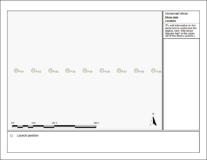
Figure 2 – Blank site layout diagram
The show name, information and optional logo in the upper right come from the menu item, “Show > Set show information…”, which includes the option to import your own company logo from a PNG or JPG. Once you have set this information, it automatically appears in any generated site layout diagrams, as shown in Figure 3.
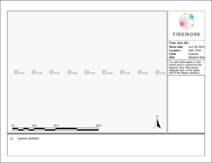
Figure 3 – After setting show information in the menu item “Show > Set show information…”
Safety circles
The site layout diagrams display safety distance circles calculated based on the effects shot from positions or based on the explicit “Safety Distance Meters” that you can type into the position properties by right clicking a position and doing “Edit position properties…” from the context menu, or by entering numbers directly into the “Safety Distance Meters” column of the Positions table window. To choose what safety circles are displayed, and to customize the formula for the calculation of the safety circles according to the purpose of the diagram and your country’s or local regulations, click on the “Window settings” link in the upper left corner of the rack layout view.
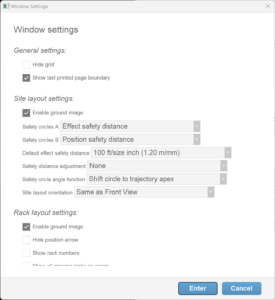
Figure 4 – Dialog from the “Window settings” link in the upper left corner of the rack layout view
The site layout diagrams can simultaneously show two kinds of safety circles, referred to as “Safety circles A” and “Safety circles B”. You can independently choose what formula each kind of safety circle displays. Figure 4 shows that “Safety circles A” are derived from the size of the effects in the positions. The field two down from that shows a choice for the function — 100 ft of safety distance per inch of effect size. The field below that indicates that the safety circles are not adjusted for wind. The field below that specifies how the safety circles are affected by the effects’ shot trajectory angles (to enable the adjustment from the effects’ shot trajectory angles, you must also set the first field to “Effect safety distance + angle” instead of just “Effect safety distance”). Each of these fields has various options you can choose from.
The dialog of Figure 4 also specifies that “Safety circles B” show the safety distances that you manually enter into the “Safety Distance Meters” property of the positions. Based on purpose of the site layout diagram, you may choose one type of safety circle calculation or another. For example, the safety circles based on effects themselves are terrific to catch any errors of misplaced large caliber shells in smaller caliber positions. You may also want to experiment with angle adjustments to see the effect of shot trajectory angle on the expected fallout area.
In the rack layout view while editing it is often useful to show two kinds of safety circles simultaneously. Figure 5 compares two safety circle calculations: the yellow safety circles are simply 100 feet per inch of effect size. The red safety circles are 70 feet per inch but they also take into account the trajectory angle. The effects in this example are fanned out from side to side, and consequently the red safety circles create a hotdog-like shape that is much wider than the line of nine positions.
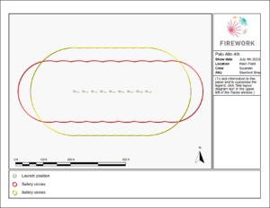
Figure 5 – Yellow circles: 100ft/inch; red circles: 70ft/inch adjusted for trajectory angle
Background map, magnification, and orientation
The background map in the site layout diagram comes from the “Scenery > Set ground images” submenu. As you can see by comparing the magnification levels between Figure 3 and Figure 5, the site layout diagram automatically centers and magnifies the displayed image to ensure all the elements in diagram are visible — positions, safety circles, and drawings. The site layout blueprint, which you can edit from from blue gear menu in the upper right of the rack layout window (“gear menu > Create or edit diagram template > site_layout_diagram”), provides additional options for centering and magnification, as well as other formatting options such as the color of positions, the size of the legend or information panel, the colors of safety circles, etc.
The compass indicator in the lower right of the site layout diagram is, by default, the “Front view and site layout orientation” that you can set in the “Show > Set show information…” menu or that you can set to any angle by rotating the 3D view to your desired “look” direction, right clicking on the ground, and selecting the context menu item “Set as front view”. Figure 6 shows the site layout diagram after adding a Google map background and setting the front view to face in the direction of the audience’s view. Notice the compass indicator points North downward in the site layout diagram.
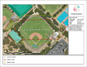
Figure 6 – If you set the front view, the site layout diagrams will rotate to match it (notice the compass arrow).
Drawings
The “Draw mode” link in the upper left of the rack layout view presents a dialog of drawing tools: Lines, Circles, Rectangles, Rulers, Arrows, Icons, and Text boxes. The dialog also includes property fields that will apply to drawn elements, such as line color, fill color, etc., as shown in Figure 7.
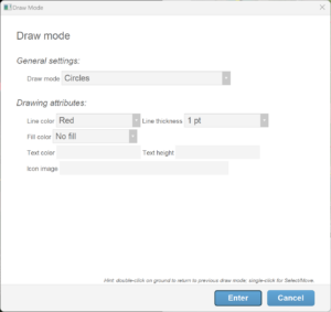
Figure 7 – “Draw mode” dialog accessed by clicking the link in the upper left of the rack layout view
Using the drawing tools, you can add icons for scene elements like the audience, fire extinguishers, barricades, etc. You can draw barges and roof top areas. Add rulers to show important distances. Add annotations, titles, etc. Figure 8 shows the example scene after adding a few drawings.
![]()
Figure 8 – Site layout after adding some icons and drawings
As a second example to illustrate what is possible, Figure 9 is an indoor site layout diagram that is drawn entirely with the Finale 3D drawing tools, without a background image
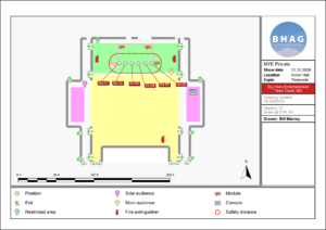
Figure 9 – An indoor site layout diagram drawn entirely with the Finale 3D drawing tools
The drawing tools support many of the common user interface conventions for drawing software — control-C, control-V to copy/paste; control-click-and-drag to clone; right-click for context menu with functions like group/ungroup, bring-to-front, etc.; right-click to edit properties. The user interface includes a few shortcuts for quickly returning to the previous draw mode, or exiting a draw mode. A list of important but somewhat hidden user interface features is given in Table 2.
Table 2 – User interface features for drawing
| Action | What action does |
| Right-click on an element | Brings up context menu with group/ungroup, bring-to-front, edit properties, cut, copy, paste, delete, and clone. |
| Edit properties dialog (by right clicking) | Change any of the attributes shown in the draw mode dialog, and also: rotation, scale, coordinates, and text. The edit properties dialog is way you set the text content of a text box element. |
| Select multiple and edit properties (by right clicking) | Adjusts properties of all selected items together. |
| Control-click-and-drag | Clone the selected item or items |
| Click on the background | Exit the draw mode, returning to the “Select/move” draw mode (except not for drawing icons or text boxes, which are stamped onto the background with a single click as opposed to being drawn by clicking and dragging; you can exit these two draw modes by pressing ESC; you can choose to remain in the draw modes for multiple clicks by holding control while clicking) |
| Double-click on the background | Return to the previous draw mode (quicker than clicking the link and choosing from the dialog) |
| Control-Z and and Shift-Control-Z | Undo and redo |
| ESC | Exit draw mode |
| Click-and-drag the corner of a selected item | Resizes the item |
| Paragraph symbols in the text entry field of the edit properties dialog | The text entry field of the edit properties dialog can include multiple lines. Press the Enter key when entering the text into the field to insert a paragraph symbol. The paragraph symbols will split the text into multiple lines in the generated site layout diagram. |
Legend and information panel
You may have noticed in the progression of site layout diagrams from Figure 2 to Figure 8 that the legend at the bottom of the diagram included progressively more items, matching the elements in the scene. The legend is automatic: every unique icon, launch position, or safety circle in the scene automatically gets a legend item. The diagram in Figure 8 has three red fire extinguisher icons in the scene, for example, but it only has one fire extinguisher legend item.
If you want to add a legend item for something that you’ve drawn in the scene, or even just for some notable aspect in the background image, you can add one of the “Legend pin” icons, which come in a variety of colors. Each unique color legend pin will generate an item in the legend.
To change the text of the legend items, click on the “Site layout diagram text” link in the upper left of the rack layout view. The dialog of Figure 10 appears, with one row for each legend item, which you can edit to change the text. If you want to delete a legend item, just set its explanation text to blank.
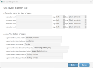
Figure 10 – Site layout diagram text dialog — for changing the legend item text and adding to the information panel
This dialog also includes four rows at the top to add text boxes to the information panel on the right. The formatting fields give you a variety of options. The text entry fields can include multiple lines. Press the Enter key when entering the text into the field to insert a paragraph symbol. The paragraph symbols will split the text into multiple lines in the generated site layout diagram.
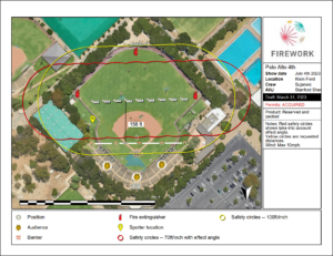
Figure 11 – The final result after changing the legend item text and adding some text to the information panel
The final result is shown in Figure 11.
Icons
One of the “Draw mode” options described earlier is “Icons”. When drawing icons you can choose from the standard library of icons shown in Figure 12, or you can import your own images.
![]()
Figure 12 – The standard library of icons includes images that are commonly seen in site layouts.
Icon images can include transparency but not blending, i.e., a pixel is either fully transparent or fully opaque. If you import a PNG image with an alpha channel, alpha values greater than or equal to 0x80 are opaque; and the others are transparent.
Since creating images with alpha channels is difficult with some paint tools, Finale 3D provides a chromakey option for imported images as an alternative to the alpha channel. The color black (#000000) or the color white (#ffffff) can be interpreted as transparent if you signal that you want it to be so by setting the four pixels in the upper left corner of the image to special values. To make black transparent, set the 2×2 grid of pixels in the upper left corner to have RGB components of #02, #03, #00, #01, starting with the pixel at coordinates 0, 0 and progressing counter-clockwise. To make white transparent, set the 2×2 grid of pixels in the upper left corner to have RGB components of #fd, #fc, #ff, #fe, starting with the pixel at coordinate 0, 0 and progressing counter-clockwise. As an example, the full RGB color value of the white transparent upper left hand corner would be #fdfdfd.
Very large shoot sites
Site layouts for shows that are miles across may not fit on a single page with a sufficient level of detail to see what is going on. A strategy for large shows involving multiple site layout diagrams — an overview diagram plus detail diagrams — is described here.